Spendesk 2.0 - Redesign
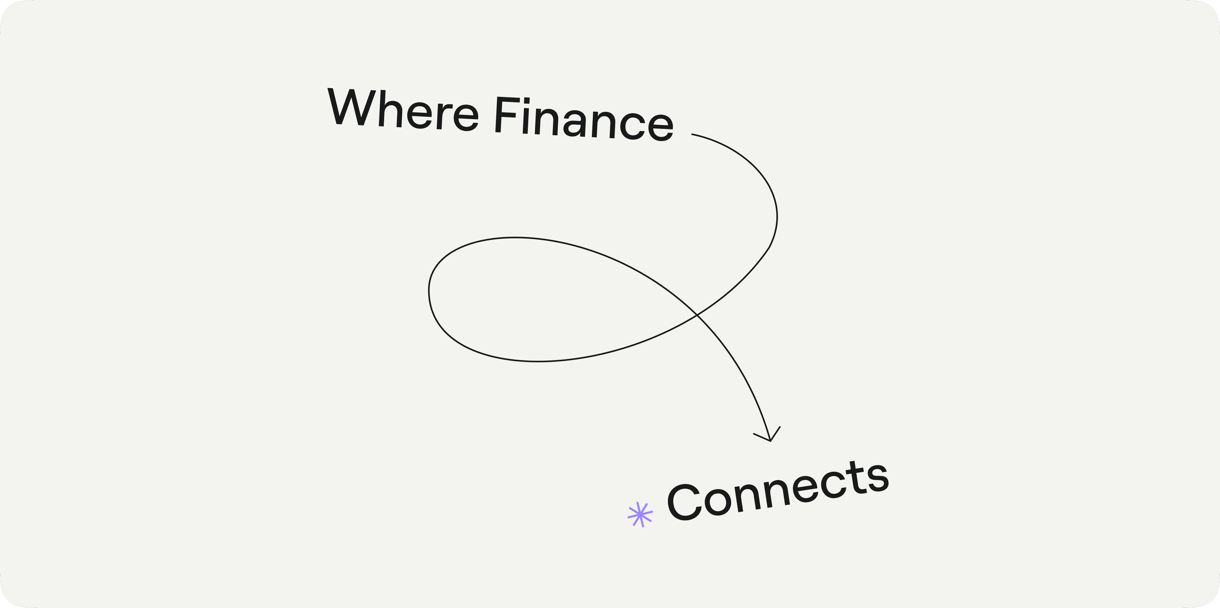
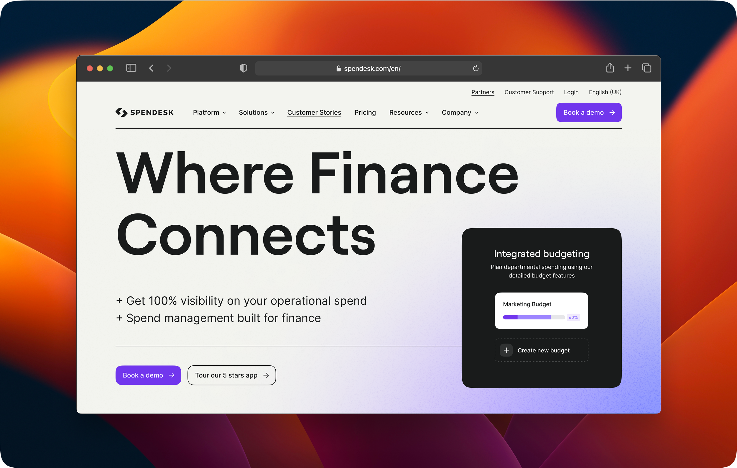
I participated in the comprehensive redesign of Spendesk's identity, which embraced Swiss design principles. This approach emphasized clean lines, geometric shapes, and rationality, all structured on grid layouts. My involvement ensured that the new identity maintained a cohesive and professional appearance, aligning with our goal of creating a more mature brand image.
Tools : Figma, Illustrator, Photoshop, InDesign, After Effects, Midjourney
Collaborative Brainstorming
I engaged in extensive brainstorming sessions with product designers during the redesign of Spendesk’s identity. These collaborative efforts allowed us to explore diverse ideas and perspectives, fostering an environment where creativity flourished. By combining our insights, we were able to craft a cohesive visual identity that truly reflected Spendesk's mission and values.
Research and competitive inspiration
The redesign process involved significant research and inspiration from competitors in the fintech industry. I contributed to analyzing various brands to identify trends and best practices, ensuring our new identity stood out. This in-depth exploration helped us to refine our approach and develop a distinctive visual language that resonated with our target audience.


Adaptation and variation work
A key part of the redesign was the extensive work on adaptations and variations of our visual elements. I collaborated with the team to ensure that the new identity could be seamlessly applied across various platforms and materials. This meticulous effort in creating versatile design components enabled us to maintain consistency while allowing for creative flexibility in our branding.

Thank you,
Feel free to have a look to www.spendesk.com to
get a full view of Spendesk’s new design principles!